Kicking the Tires of your Website
by Matt Dubnik, Chief Engagement Officer
Nearly two out of three visits to the Internet in the United States come via a mobile device. That should shock absolutely no one. However, it should cause you to give pause and think about how people interact with your website. Your digital presence, with lots of emphasis being your website, is where people go today to “kick your tires”.
Not familiar with tire kicking? A brief history lesson on this activity.
While there are several theories on when and why people would kick tires, there are two prevailing theories:
- It’s a means of determining whether a vehicle is road worthy and dates to the early days of trucking. With so many tires on one axle, a tire could look inflated but be flat because the other tires were holding it up. So, you kicked all the tires to determine whether you had a flat.
- In the early days of passenger vehicles, the tires were solid rubber. Some car dealers tried to “save money” by taking tires that were rubber on the outside, but hollow in the middle, and filling them with sawdust. If you kicked the tires, you could find out if they were “real tires”.
What it really means in 2019 is that people come to your website to give you a test of worthiness and to see what they think of your brand, all based on your digital presence. There are a few things that must be attended to on your website so that people have a positive experience and want to engage with you.

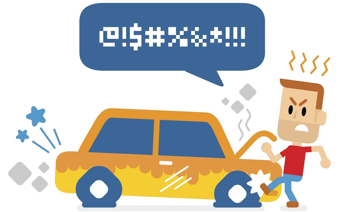
See the guy in the picture? He’s upset because he has kicked the tires and the car is not working to his liking. It’s the same thing with your website…when you don’t give people a good user experience, they get frustrated and they LEAVE.
Here are three key elements to incorporate with any website to help your site visitors find what they are looking for, think positively about you and ultimately take the action you desire them to:
- Mobile menu / navigation – there is nothing worse than struggling to find the menu button. Make it stand out; don’t be cute with it, and don’t hide it or turn it into an emoji. Keep it simple and then make sure that the links are organized, are easy to navigate between and are large enough to read easily.
- Less is more – don’t give me 99 jumping off points on your home page. Get me to the place YOU want me to go and do it quickly. People appreciate this and will have a positive feeling when they find what they’re looking for.
- Test everything – there’s no bigger buzz kill than getting somewhere you think you want to go on a website, only to find out the tool / picture / video / infographic doesn’t work for mobile. When you make changes / additions to your website, TEST them until the cows come home to make sure they work.
You work so hard on your website to present people with information and education in hopes that they will engage. In other words, when people come to kick your tires, make sure they’re not flat or filled with sawdust.
Back