For Simplicity Sake
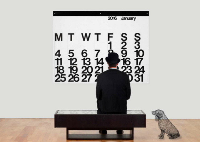
This beautiful and exquisitely produced calendar was designed in 1966 by Massimo Vignelli and taken that year into the Design collection of the Museum of Modern Art in New York. After 49 years, a design from the sixties endures as an example of excellence in modern graphic design and is most appropriate for vintage or 21st Century distinguished homes and business environments. This impressive wall calendar (in the European style where Monday is the first day of the week) turns 50 this year, and I am excited to display mine (reproduction, of course) across a huge 4 foot by 3 foot wide space on the wall. What otherwise could be filled with a racket of colors and images, this simplistic calendar uses only black and white numbers and letters.
Sometimes in the marketing industry it is hard to convince a client that not every inch of real estate should be filled with a large call out or colorful addition. The little pockets of white space are powerful. They let a piece breath, give the viewer’s eyes a resting spot and balance out the overall message.
It is tempting to add “just one more thing,” but with a little restraint a piece can shine. Looking upon my Stendig, I am encouraged to do just that – delete the fluff.
Written by Kathryn Price, Creative Director
Back