The Case Against Papyrus
When I think back to my earliest memories of learning about design I can’t help but consider the days I would spend in the computer lab during elementary school. I remember opening a blank document (usually Microsoft Word or PowerPoint) and examining all the avenues for creativity – the first one being fonts. We all might have this dropdown list memorized for the most part: Times New Roman, Arial, Calibri, etc. But, what did you choose when you wanted to give a little ~extra~ love to your words? For me, when I wanted to get really crazy, I went for Papyrus. It gave a little bit of a tattered and worn look to history presentations, or maybe I would choose it if I wanted an earth-friendly vibe for a science project. Little did I know, that old standby would transform into a typeface that I (and many designers) would despise. Now that I have grown older and wiser in my design knowledge, my mission is to eradicate (maybe that’s a little too harsh – retire?) the use of Papyrus.
Papyrus was created in 1982 by a man named Chris Costello. At 23, Costello wondered what a font would look like if it had been created at the same time as the Bible and written on papyrus paper (Aha!) The result is the font we know and love (or loathe) to this day. Papyrus was sold by Costello to International Typeface Corporation and is now available on all computers that use a Mac or Microsoft operating system. Even Costello himself claims, “it was not my intent (for it) to be used for everything. It’s way overused.”
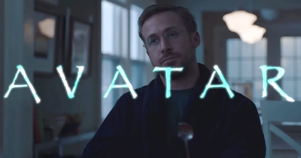
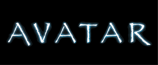
Today, if you walk out the door and drive to your local grocery store, I guarantee you will not return without running into at least one instance of Papyrus. This font is like a visual earworm – once you start looking for it, you cannot stop seeing it. The typical instances of Papyrus are generally seen when someone wants to convey a “green”/healthy/earthy feel – think organic foods, homemade soaps, essential oils, etc. However, I have also seen it on neighborhood entrance signs, restaurant menus, flyers, and let’s not forget, the logo for the first Avatar movie (Saturday Night Live has done a great skit expressing one graphic designer’s frustration at that example).
I think what grinds my gears the most about Papyrus, besides the fact that it’s way overused, is that as a designer, when I see a company using this font, it leaves the overall brand feeling devoid of substance. When I’m designing a logo or working on branding for a company, my goal is to create something that has had thought and care put into it. Fonts are such an important component to a brand, and they can create drastic differences to the overall feel of a design. Designers want to make sure that much consideration has been put into font selection and that many options are explored before landing on the final choice. When I’m thinking about a font or color (or shape even), I ask myself, “Does this feel like x company? Does this align with their voice?” If the answer is no, I know to move on to something else.
As much as I would love to retire Papyrus, I understand some people are very attached to it. However, I will make some suggestions on how to achieve that feeling or look that Papyrus gives to a design without resorting to actually using it.
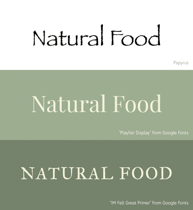
At the top of this image is an example of the word “Natural Food” written in Papyrus.
Below that are those same words using the font “Playfair Display”, which is not textured or rough like Papyrus is, but the colors used skew on the earthy side giving it that “nature” feel.
If you really feel the need to go with a font that has some character and texture to it like Papyrus, the last option shows a way to achieve that.
This font is called “IM Fell Great Primer”. The texture is subtle so it doesn’t scream at the viewer, but it’s noticeable enough that it gets the feeling across. Both “Playfair Display” and “IM Fell Great Primer” are from Google Fonts, which has a plethora of free font options that anyone can download and use.
Of course, if you find yourself at a crossroads and in danger of falling victim to Papyrus please reach out to the friendly designers at Forum! We’d be happy to help create something you can be proud of that won’t leave us designers shaking our hands, yelling “Papyrus!!!”
Back