Graphic Design: Hiding in the Shadows of Film and Television – Horror Edition
by Elizabeth Brill, graphic designer
The “Spooky Season” is here and along with it comes some of my favorite things: candy corn, pumpkin carving, corn mazes, and fall weather. But the one thing I look forward to the most this season is SCARY MOVIES. I love the adrenaline rush that comes with a good horror film or the feeling of nostalgia that rises when I hear the intro song for Nightmare Before Christmas. I bet most people have a favorite film or show they like to watch this time of year. They know when the jump scares will happen or who is the crazed killer on the loose. But someone you might not realize is a small part behind the mask of film and television is a graphic designer. That’s right! The newspaper your detective character is reading? Designed. The sign in front of the creepy abandoned library? Designed. The logo of the local police department in the sleepy town where nothing bad ever happens? Odds are, it was designed. Every art department in film and television has a graphic designer on hand to create the little details that make your creepy movie or show that much more believable.
Here are some examples of design in a few of my favorite spooky movies and shows:
The Sixth Sense directed by M. Night Shyamalan
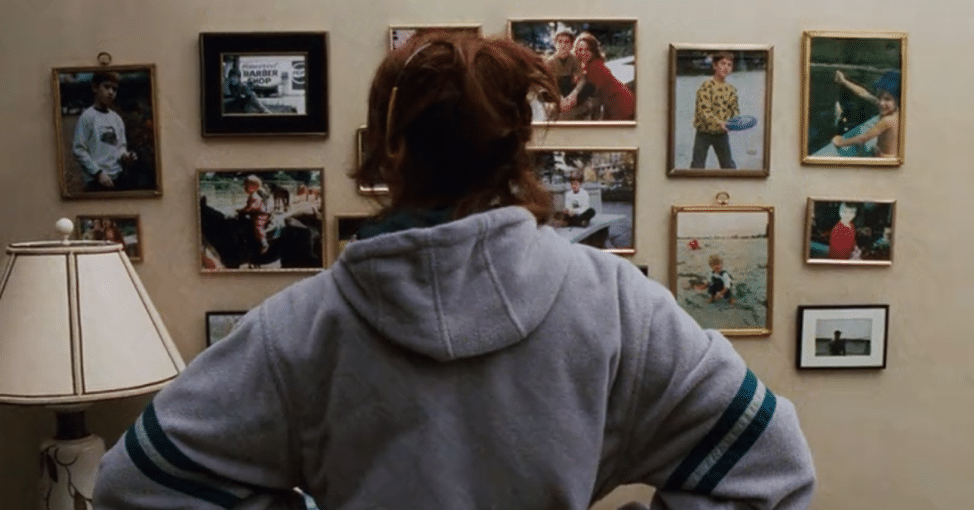
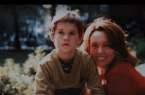 This story is about a boy named Cole (played by Haley Joel Osment) who is tormented by ghoulish visitors and confides in his therapist (Bruce Willis) for help. There is a scene in this movie where Cole’s mother, Lynn (played by Toni Colette), is staring at a wall of family photos when she notices a strange glare on a photo of her son, Cole. Suddenly, she realizes this glare is appearing in all photos of Cole. Now, since we have no evidence that M. Night Shyamalan had a real specter pose in these photos, how were the flashes of light produced? Most likely, a designer made them.
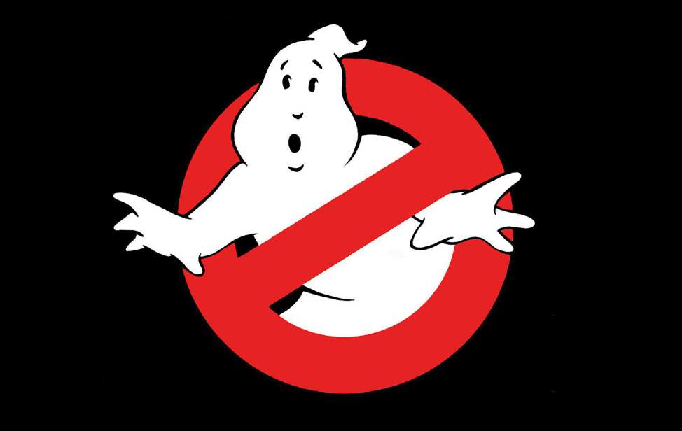
Ghostbusters (1984) directed by Ivan Reitman
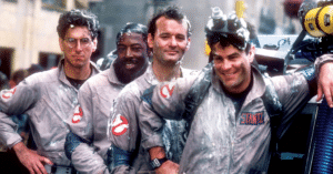
Ghostbusters is a wonderful, frightening film about a team of scientists who begin a ghost exterminating business in New York City. I’m guessing if you’ve seen this film a few things come to mind when you think of it: the theme song (of course), the giant “Stay Puft” marshmallow man, and Bill Murray’s witty sarcasm. And of course, the first image that comes to mind is the Ghostbusters logo, created by graphic designer Michael C. Gross. Not only did the logo serve as a main advertising piece for the film, but it was also used throughout the film as the signage outside of the Ghostbusters office, on the side of the Ghostbusters vehicle, and on their uniforms to name a few. It just goes to show how far branding can take any business and how much of a mark impactful branding can leave on your customers.
Hocus Pocus directed by Kenny Ortega
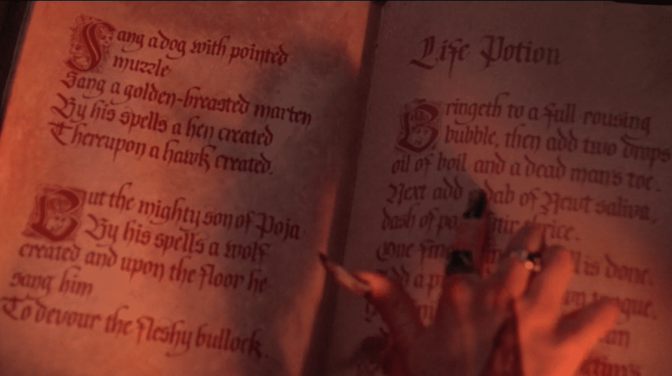
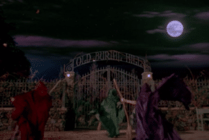 Hocus Pocus is a Disney film that tells the story of the Sanderson sisters – three evil witches (played by Bette Midler, Sarah Jessica Parker, and Kathy Najimy) who were executed during the Salem Witch Trials and came back to life on Halloween night in 1993 to enact their revenge upon the town. Many details in this film were carefully designed to make the props look accurate to the time and feel of the film. The calligraphy in the spell book used by the witches certainly looks like something that would be written in the 1600’s, and the eerie cemetery gate and graveyard props fit right in with the classic spooky feel of the movie.
Stranger Things directed by Ross and Matt Duffer
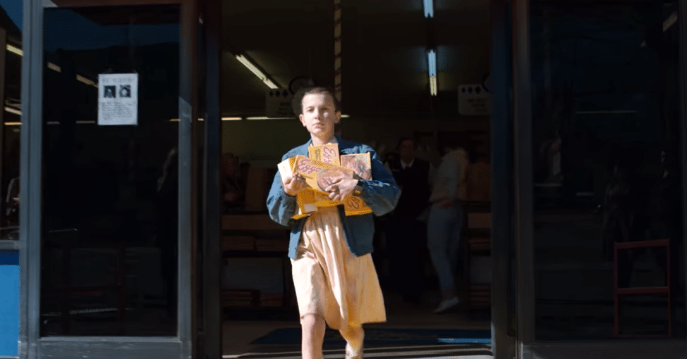
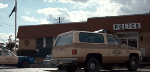
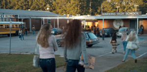 Stranger Things begins with the disappearance of Will Byers (played by Noah Schnapp) and the subsequent search for him by his mother, Joyce (Winona Ryder), police, and friends. The search soon unveils monsters, government secrets, and a girl with telekinetic powers. While this isn’t a classic Halloween choice, I still love this popular show for its science fiction scares and amazing story line. The series takes place in 1983 in a small Indiana town. Since the show first aired in 2016 (and was filmed in Georgia), the art department undertook no small feat to create props and designs that were accurate to the period and location. From the signs of Hawkins High School, to the police cruisers and the numerous boxes of Eggo waffles, everything had to be designed to transport the viewer back to the 80’s and into Hawkins.
As a graphic designer myself, I have so much respect for the people working in film and television doing design. The knowledge that it takes to create a whole world that is believable to the eye and tricks the viewer into thinking these characters and places are real astounds me. The magic of graphic design is that it often stays in the shadows. I’m reminded of this quote by Joe Sparano: “Good design is obvious. Great design is transparent.”
It takes a lot of effort to create a great design, but once you achieve it there are no limits to where it can take you. Whether that’s a new brand for your company, a marketing campaign, or even just a business card – great design will keep you moving forward and leave an impact on your viewers. And maybe, just maybe, it’ll keep the monsters at bay, too!
Back