LONGSTREET CLINIC
Branding
THE CHALLENGE
Already a widely recognized practice throughout north Georgia, Longstreet Clinic nevertheless wanted to distinguish itself from other practices in the region and innovate. Therefore, Longstreet undertook a practice-wide rebranding as part of its makeover.
This branding needed to help the clinic to maintain the strength and confidence it has already built within the community, while also carry its reputation forward and show these qualities to a new group of patients – remember how much the region has grown since Longstreet’s inception in 1996. The new brand needed to be fresh, inspirational and – as with all brands – eye-pleasing and instantly recognizable.
Logo Variations
![]()
HOW WE HELPED
One of the first things Forum Communications did was to canvas Longstreet employees and physicians to discuss with them what they thought was important about their organization. We also learned what they wanted portrayed about Longstreet. We then looked at their previous branding and began to determine how we could incorporate parts of the clinic’s past into its future – so that current employees and patients could see the continuity. We also accounted for the very region in which Longstreet Clinic operates. Just like people and buildings, organizations can develop a sense of place, and it is important to retain that sense. After weighing all those options, we crafted a new logo that we unveiled to Longstreet employees before revealing it to the wider world, including advertising, social media, direct mail, and packaging campaigns.
ALL IN THE DETAILS
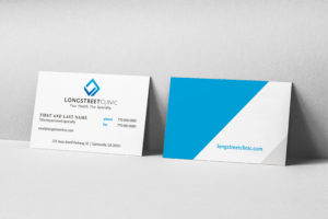
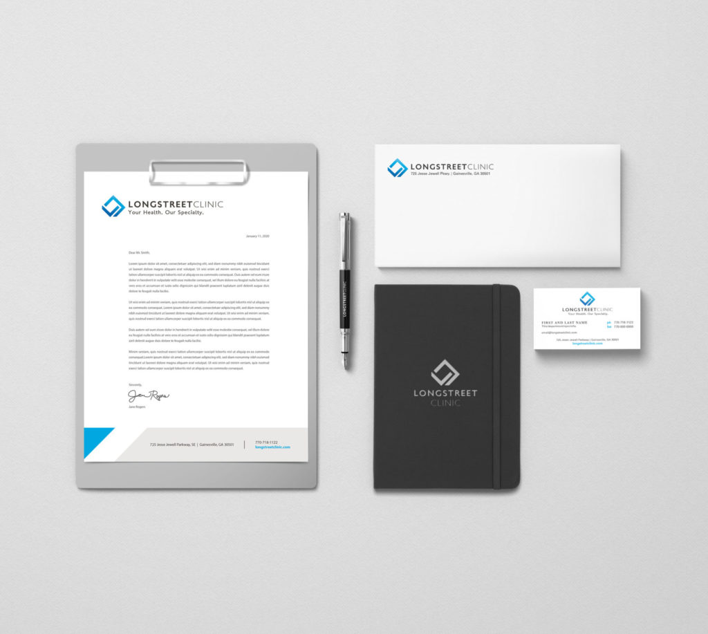
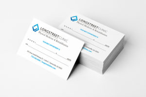
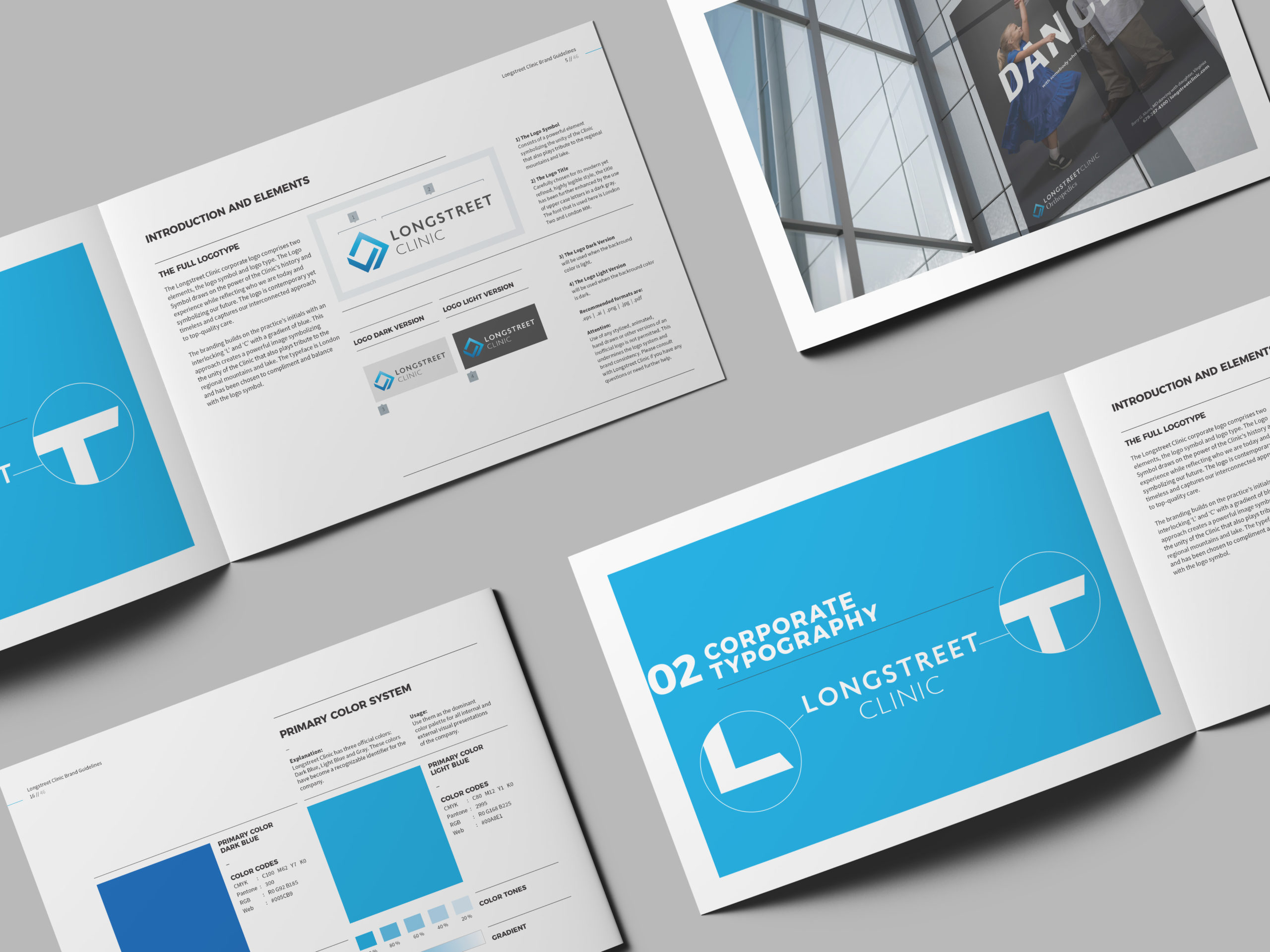
The biggest factor in this branding was unity, which is why we developed the tagline: “Your health. Our Specialty.” This succinctly shows the focus and mission of the clinic which first and foremost is taking care of the patient but also reinforcing their value in access to multi-specialty care. We also updated the name “The Longstreet Clinic” to simply “Longstreet Clinic” as well as created a common naming system for all specialities in order to create a cohesive hierarchy naming system that would directly associate with the parent brand Longstreet Clinic. The design itself, a stylish “LC”, depicts Longstreet’s interconnected approach to top-quality care – all while paying tribute to the mountains and lake around which Longstreet’s many campuses are situated. In a nod to its foundations, the logo retained a familiar blue color (though an ombre, or gradient, was added). This color symbolizes trust and stability while the ombre brings life and energy to the mark itself, something designed to lift the eye upward and to feel momentum. The entire project built on a tradition of interconnected, top-quality care while emphasizing stability, inspiring trust, celebrating a region, and exuding energy and strength.