Bridging Hope
Rebranding and Website Design
THE CHALLENGE
Founded in 1988, Bridging Hope is a nonprofit organization located in northeast Georgia that supports and advocates for survivors of any type of sexual abuse or assault. The organization’s free and confidential resources are available to survivors, ages 13 and older, and their loved ones in Dawson, Forsyth, Habersham, Hall, Lumpkin and White counties in Georgia. In addition, the Bridging Hope team conducts prevention education programs to raise awareness and educate our communities about sexual assault.
Bridging Hope provides essential support and education to the community. However, its original name, Rape Response, sometimes presented challenges – both in the organization’s community outreach and for the victims that it assisted, as reading/hearing those exact words sometimes triggered feelings of fear or re-traumatization. For instance, it was not always easy for Rape Response to communicate with schools, non-profit fairs, and other groups that were interested in the organization’s powerful presentations but were hesitant due to the name. While the mission remained strong, the branding sometimes limited outreach and made sensitive conversations more difficult.
Leaders within Rape Response determined that a new brand would better serve the organization’s mission and better serve both survivors and the broader community. They wanted a brand that was both simple and uplifting, one focused more on the emotional side of recovery and healing – a brand that prompted a sense of safety and hopefulness rather than one focused on the trauma of sexual assault. Rape Response partnered with Forum Communications for help in overseeing a full rebrand – including designing and marketing a new name and logo, creating new print collateral, and building and launching a new website.
![]()
HOW WE HELPED
Because of the sensitive nature of Bridging Hope’s work – supporting survivors and their loved ones through life-altering and potentially devastating circumstances – Forum Communications undertook its role with utmost sincerity and responsibility. This process began with a comprehensive look at the many roles within Bridging Hope and its partners, laying the groundwork for a shared understanding of stakeholder priorities and viewpoints. The Forum staff also conducted numerous focus groups within the community to gain a thorough understanding of perceptions about the role of Bridging Hope. This exhaustive and informative process allowed us to determine a new name and logo – one designed around Bridging Hope’s mission of connecting survivors with support, healing, and hope for the future.
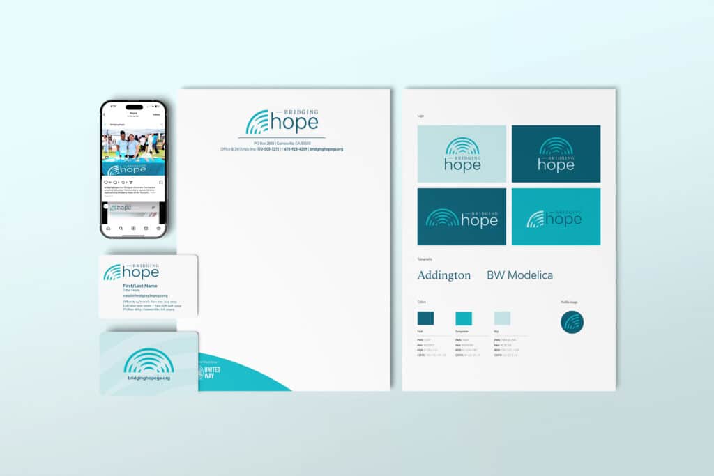
Once a new name was determined and approved, Forum Communications began the work of developing a new logo. This new design helps imprint Bridging Hope’s identity within the community – all with the goal of promoting trust and understanding.
Once the logo was completed and approved, Forum Communications moved into producing print collateral reflective of the new name and logo and designing and developing a new website.
![]()
ALL IN THE DETAILS
At Forum, we find that consistent and clear communication with our clients creates the best results in all situations – and that was certainly the case when creating a new name and logo for an organization with as important and valuable a mission as Bridging Hope. In this instance, we considered all aspects of language and design. We workshopped dozens of ideas across Forum staff and with Bridging Hope leadership. The word “bridge” conjures a firm, reliable structure, one that connects and provides a passage from one place or state to another. It can symbolize a desire to connect with what is on the other side, and in this case, directly to “hope.” Both Forum and Bridging Hope found that wording appealing, without being too abstract as to confuse the organization’s mission.
In creating a new logo, Forum leaned into the concept and imagery of a bridge. We did so by utilizing arched lines that convey a bridge-like structure. Combined with repeating lines, the structure conveys the act of transformation – a bridge that becomes a rainbow (a symbol of hope). That is only the start of the detail, however. Forum designers also drew inspiration from lighthouses and the symbolism these structures convey: a guiding light, leading people through darkness and storms to safety. Specifically, lighthouse lenses became a focal point. That is why the new Bridging Hope mark evokes concentric circles (reminiscent of a lighthouse lens). Arches within the mark are also intentionally broken and jagged, representing a survivor’s journey through trauma. The outermost ring, the only solid ring in the mark, represents the organization – a bridge providing hope, strength, connectedness and support.
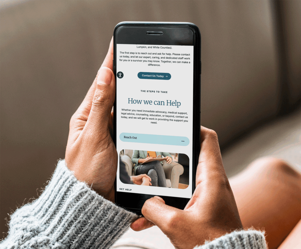
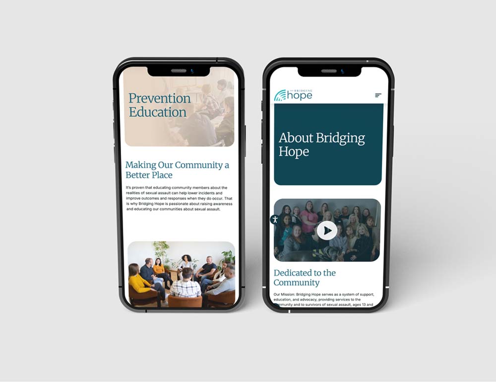
Forum also endeavored to create a website that united all aspects of the rebranding campaign. This website needed to be informative, educational, and easy to navigate. Thus, our goal was to provide an intuitive user experience with clear, concise information about how Bridging Hope serves survivors and the community. To that extent the new site provides a complete story, as well as context about Bridging Hope, its staff, volunteer roles, how it assists survivors (and loved ones), how to get involved with its mission, and – most importantly – how to obtain immediate help after an assault has occurred, no matter the timeframe. It is a multi-language site to provide access to all individuals and features an intuitive interface button that allows a visitor to immediately leave the site as a precaution for those concerned about their safety.