Turning Thirty: Design in 1995 vs. 2025

As I round the corner to turning thirty, I thought it would be a good exercise to compare what life was like in 1995 versus 2025. For the sake of relevancy (and brevity), I decided it would be fun to look at graphic design in particular, exploring what was considered cool and groundbreaking in the 90’s and seeing how that holds up to today’s standards. What I found during this research was that some things (breaking the rules of design, utilizing the power of color, and reliance on digital technology) have stayed true and are still relevant today, while others (novelty typography, harsh corners on user interfaces, visual noise or texture) have become stale in the design world. I have broken down my exploration into three main categories: music, consumer goods, and technology.
Music
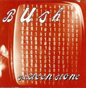
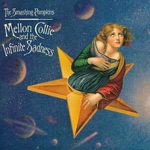
The 90’s had so many great music movements and genres that were bursting on the scene with corresponding subcultures forming around them. Grunge rock is definitely one that I remember hearing on the radio and has made a lasting impression on me. When you look at the cover art for some of the CDs from that genre the design definitely reflects the style and themes of the music – disjointed, intriguing, and loud. The designers relied on experimental or hand drawn type (see Garbage’s self-titled album, or Bush’s Sixteen Stone), visual noise and distortion, and unique imagery (the iconic cover of The Smashing Pumpkins’ Mellon Collie and the Infinite Sadness is still burned into my brain). Very few of the artists I looked at included images of the band itself on their album cover.

Fast forward to 2025, and the album artwork for popular music of the time looks vastly different. Some artists rely on bold but simple typography and color (Charli XCX’s famous lime green Brat), but most of them focus on an image of the artist themselves in some fashion. The covers of Hozier’s album Unreal Unearth and Beyonce’s grammy-winning Cowboy Carter definitely rely on unique and attention-grabbing images. One stark contrast between album artwork from musicians today and those of the ‘95 era is the lack of novelty or hand drawn typography, and in fact, some have no text at all on the cover.


Consumer Goods
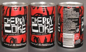
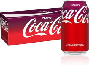
The popularity of hand drawn lettering didn’t stop at rock band album covers – even consumer products of the 90’s were jumping on the trend. One thing that definitely brought back memories for me (even though I obviously wasn’t sipping soda in infancy) was the unique and chaotic design for the Cherry Coke can. You can see the influence of the “grunge” look here with the use of jagged scribbles and stark contrast of red and black. The type for “Cherry Coke” does not appear to be computer-generated and the overall look goes against any design rules that had previously been in place. When you compare it to today’s Cherry Coke can with its iconic “Coke” branding, clean gradient, and flat design, it’s unrecognizable.
Technology
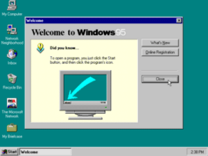
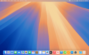
Last but not least, we must discuss desktop computers and particularly what the user interface looked like in 1995 vs. what it is now in 2025. With the release of the world wide web to the public in 1993, and rapid increase in the popularity of personal computers, 1995 was right at the start of the computer becoming a staple in the average American home. When I think back to what the desktop screen looked like in my youth, I remember lots of 3D icons, beveled edges, drop shadows, and sharp grey boxes with black outlines – see the Windows ‘95 screenshot below. The rise of the personal computer also contributed to use of novelty fonts (hello Comic Sans) as well as wider availability of digital software being used for design (Adobe was already a popular player in the digital design market and still is). Looking at my Mac computer today, the interface is vastly different from the Windows ‘95 screen – all of the icons are colorful, flat shapes (or use very subtle gradients), and are contained in rounded squares. There are no harsh black outlines to be found. Dialog boxes are white or very light grey, and the overall feel is very sleek and modern. However, I do use Adobe products and digital design is still the main tool for me as a graphic designer, so those pieces of technology have stuck around.
There are a lot of cool things from the 90’s that make me grateful for being born in that era, like the music, clothing, and experimental aesthetics in art. However, I am so grateful for modern technology when it comes to being a designer. Even though I love to incorporate hand drawn illustrations or elements, I could not do my job without my beloved computer and design software. I’m thankful I took the time to look back at the start of my 30 years and briefly relive the culture I was brought up in. Now I can pull elements from that time and incorporate them into my present and future work as a designer. Here’s to many more years and much more graphic design history to experience!
Back